 Titan DesignsLEO ROGERS · DESIGN
Titan DesignsLEO ROGERS · DESIGN
Titan DesignsLEO ROGERS · DESIGN
Custom mascots, brand characters, packaging artwork and vector illustration, built to carry a brand on their own.
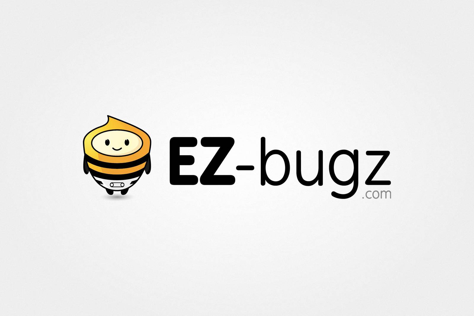
Some of the most enjoyable briefs I get are the ones that start with almost nothing - a napkin sketch, a rough idea of a personality, sometimes just "we want a character." This strand of my work is that: custom mascots, brand characters and standalone illustration, taken from rough concept through to a finished, fully scalable vector asset that a client can use anywhere from a business card to a shopfront sign.
I don't like to pigeon-hole what I take on here - when a brand wants something a bit more expressive than a standard logo, whether that's a crudely-sketched idea on a napkin or a request to riff on an established style, I'm generally up for the challenge. Anything that earns a smile or a second look is a project worth doing.
Every project starts with concept sketches - usually several directions, so the client is choosing a personality, not just a drawing. Once a direction is picked, I take it into vector to make sure it holds up at any size, print or screen, without degrading.
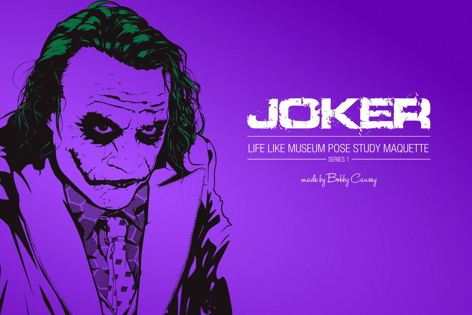
Some of this work is built to sit on a shelf rather than a screen - poster and packaging-style artwork made to accompany a physical piece. This tribute poster was produced for a limited-edition "Life Like Museum Pose Study" maquette sculpted by Bobby Causey, pairing a hand-drawn portrait with poster-style type treatment.
Mascot work is where a brand's personality gets to run loose - a small cast of characters that can carry packaging, a kids' range, or a sports club through decades of use. A few examples from that side of the work:
WineOwners.com is a repeat client - this mascot and logo lockup carries the brand across their site and marketing, a friendly hand-drawn character standing in for a fairly serious wine-portfolio-management product.
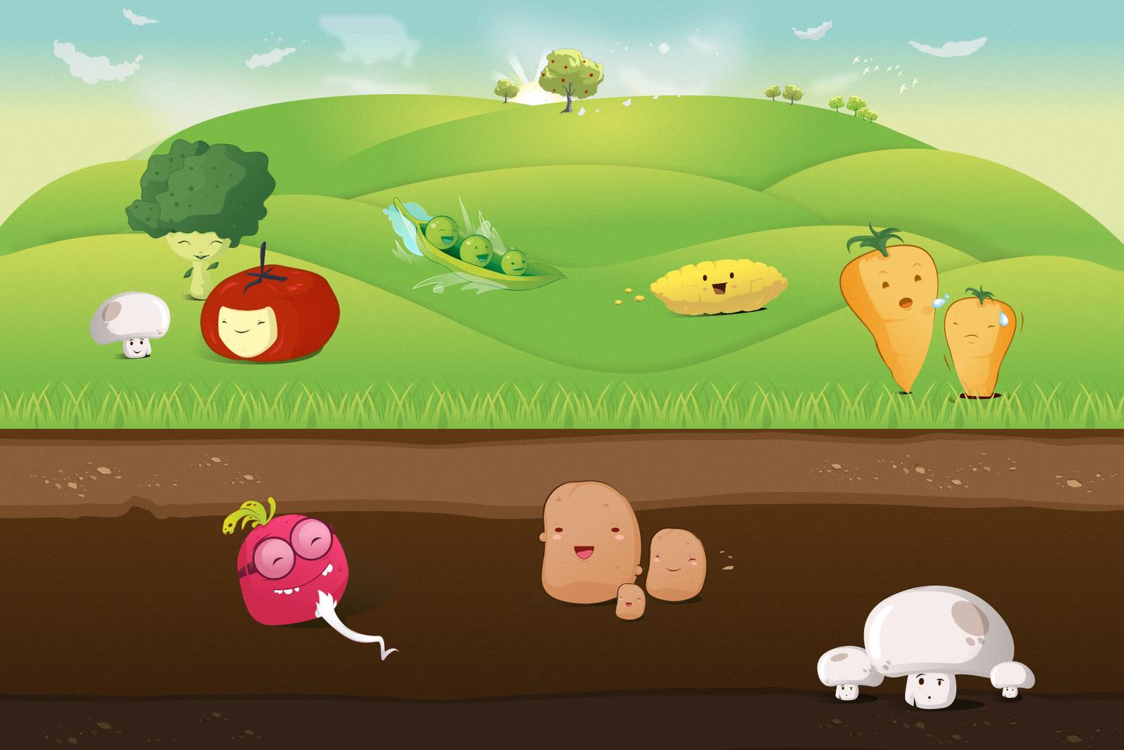
A set of vegetable characters designed as a mascot concept for a food brand - one of those briefs where the challenge is giving a dozen different vegetables a dozen distinct personalities without the set feeling repetitive.
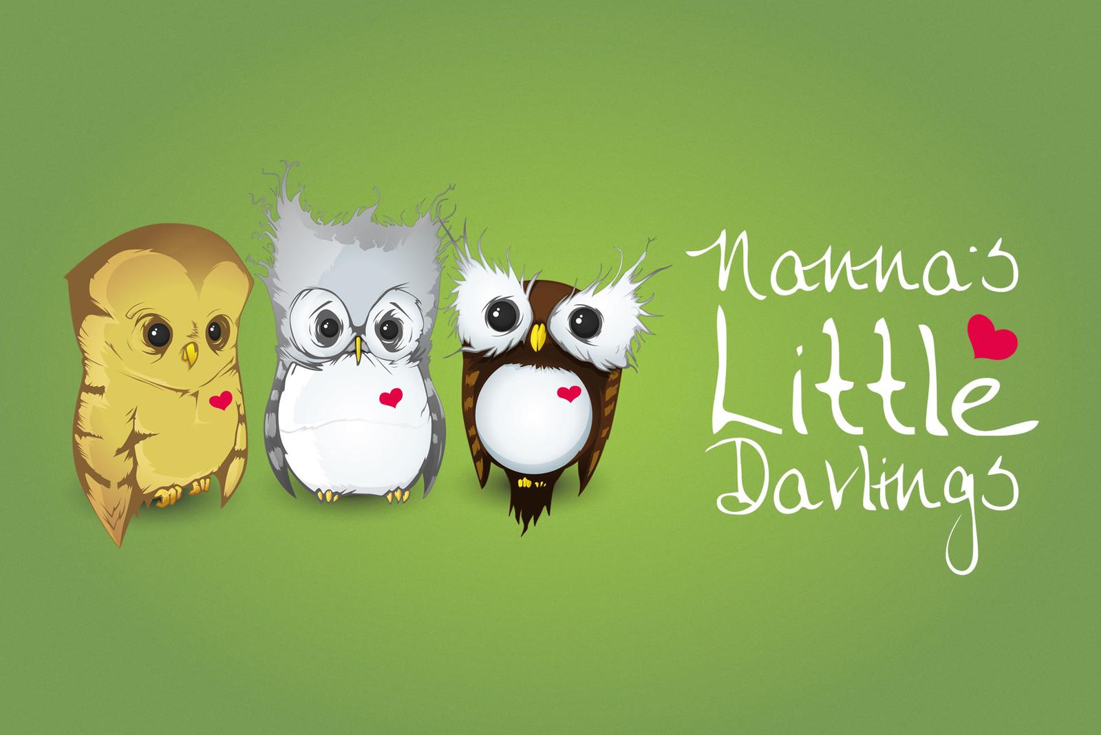
"Nanna's Little Darlings" - a trio of collectible owl characters, each with their own distinct expression and colouring, designed to work equally well as a set or individually.

A more painterly, fantasy-leaning character piece - a trident-wielding swimmer facing down a tangle of tentacles, done for the sheer enjoyment of working in a moodier, more atmospheric style than most branding briefs call for.
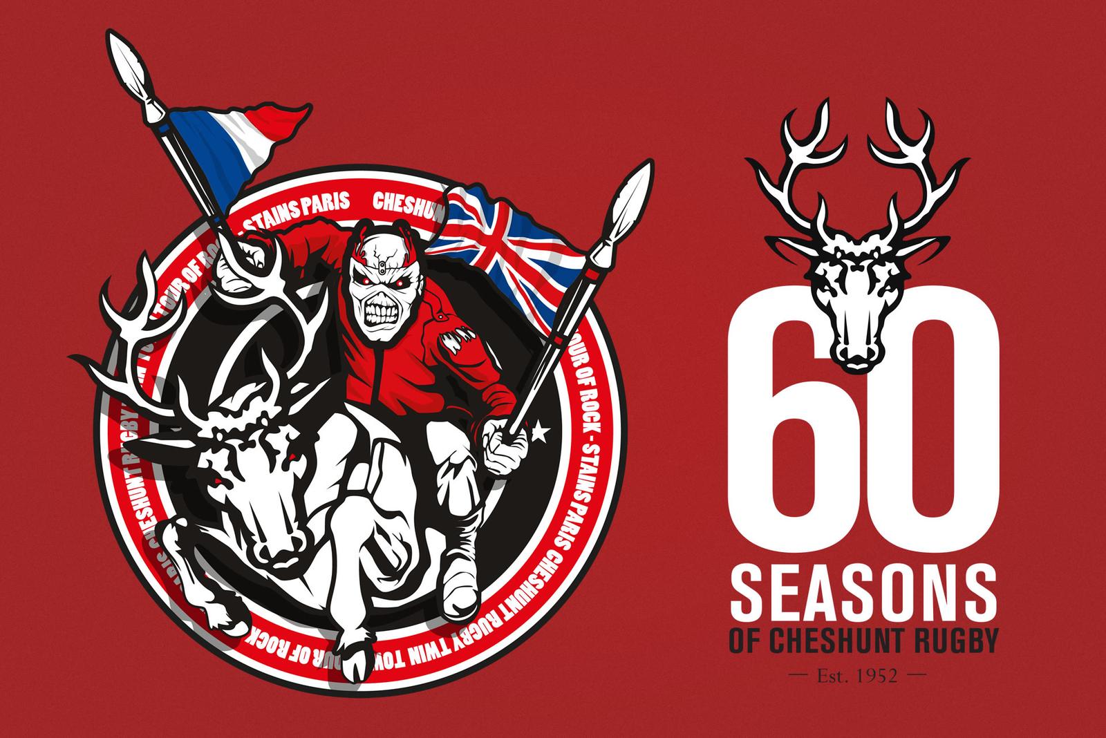
Cheshunt RFC has been a repeat client over the years - this badge marked the club's 60th season, built around their stag crest and a nod to a supporters' tour.
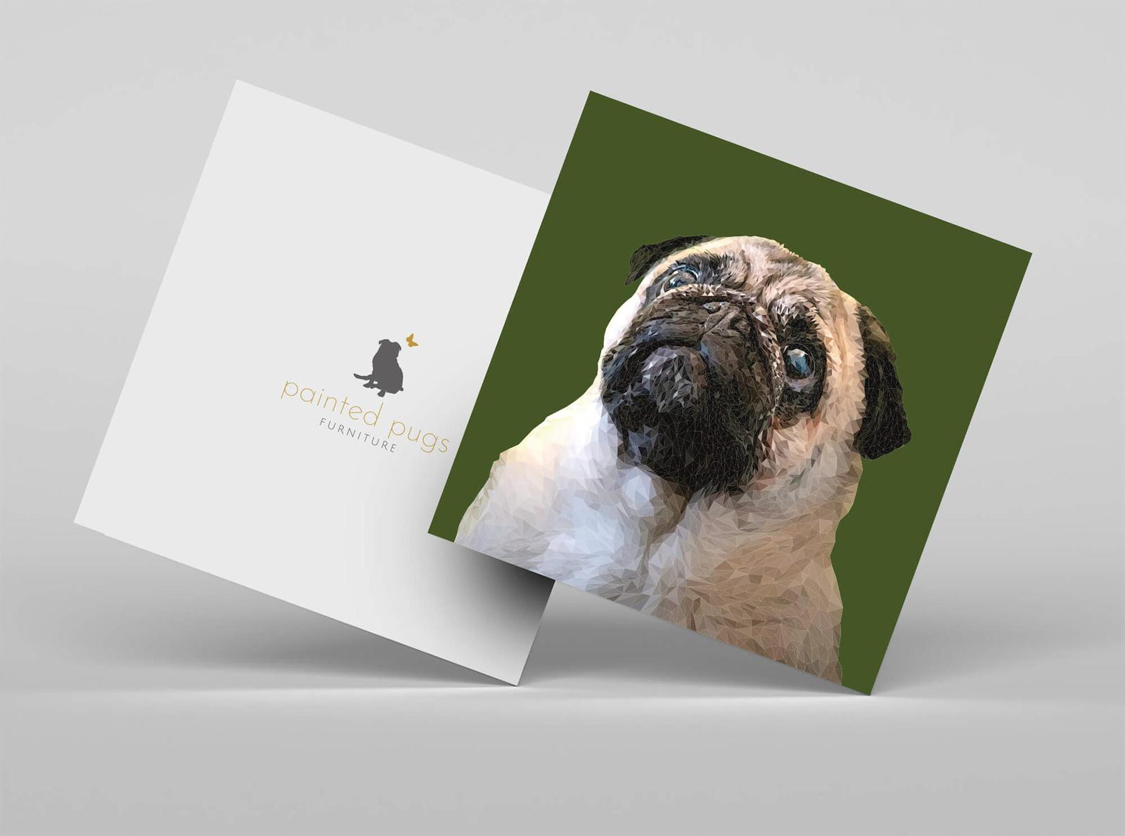
Painted Pugs Furniture is my own side-project rather than a client - a small furniture brand and low-poly pet-portrait concept, inspired by the pack of rescue pugs I share my home with.
"Leo provided amazing concepts on a really unique character design and brought him to life. It was hard to choose - the final design was a fantastic, modern and fun way to boost our rebrand. A pleasure to work with, and I highly recommend his skills in character illustration."
Nicole PribicevicPeaceLoveDesign.net
"Titan's branding and designs gave us a strong, visually compelling identity for launch, and an online platform that has won plaudits as the easiest to use and most engaging in our sector."
Nick Martin, DirectorWineOwners.com
"Leo took my rough drawing and created exactly what I wanted, delivering professional, quality work with responsive communication."
Bobby Causey, SculptorBobbyCSculptures