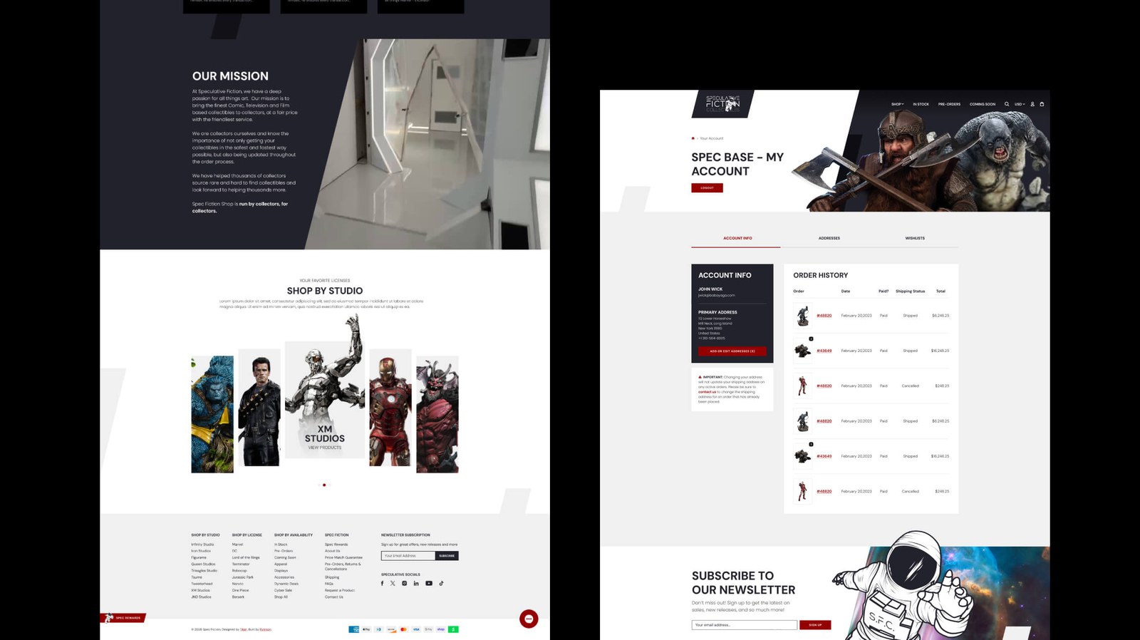
Titan DesignsLEO ROGERS · DESIGN
Titan DesignsLEO ROGERS · DESIGN
Titan DesignsLEO ROGERS · DESIGN
Fusing a long-standing client relationship with a shared passion for pop culture into a unique, responsive offering for the collectible community.

Titan has had the pleasure of working with Todd Johnson - the Toddfather - and his brand Speculative Fiction Collectibles for some years now, having previously redesigned the Spec Fiction Shop to its 2.0 version: an eCommerce site built for statue, figure and pop-culture collectibles.
Todd had spent the last couple of years bringing his passion for pop culture - 2001: A Space Odyssey in particular - to life in his California-based warehouse gallery, with sleek black accents, gloss white panelling and lighting reminiscent of the iconic film. Off the back of some initial concept work, I offered to reinvent the website so that his offline and online presence finally married up into one cohesive space.
While familiar with the brand, the challenge was to stay within the platform Todd was already committed to, Shopify - which can be fairly restrictive, particularly at checkout - while still elevating the buying experience enough to surpass the competition in the same retail sector.
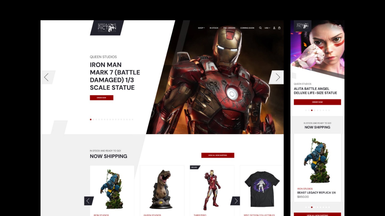
A project like this would typically start with concept design or wireframing, establishing what currently works and what can be improved. Unique to this one, I started by rewatching 2001: A Space Odyssey for style inspiration - the classic, seen with a wholly different eye, trying to understand its sterile-yet-modern interiors mixed with 1960s industrial design, and the bold pop of red furniture against minimalist black-and-white living spaces. All of it in service of respecting the phenomenon and cultural impact of the film.
Some convincing was needed at first - red is typically associated with error warnings - so a handful of initial page designs were built around red for calls-to-action and links, set against white, black and light greys to draw the eye cleanly from homepage to checkout.
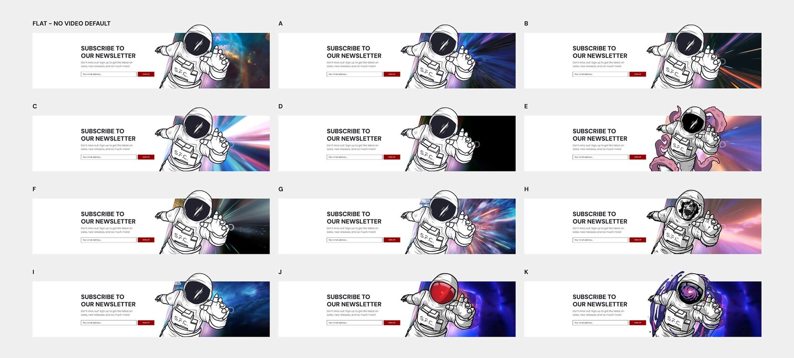
Once approved, I worked on an entire desktop and mobile suite in tandem, overhauling every page while respecting the content that mattered within it. Arguably the biggest changes - and the greatest impact - landed on the homepage, collections and product pages: the once dark, repetitive theme replaced with a brilliant white style, dark angular accents, hints of red and a heavy emphasis on overlapping elements and imagery.
Beyond the designs themselves, a colossal part of the process was a direct consequence of the design choices made. Using transparent product imagery to put the collectibles front and centre meant updating the entire product range with a high-resolution transparent cut-out for every item - well over 6,000 products in total. Plenty of that could be batch-processed to resize, upscale and mask, but many hours still went into doing it by hand. Odd as the effort might sound, the outcome speaks for itself: where the 2.0 imagery had no consistency beyond cover size, this new set of transparent images sits on any background colour and reads as one cohesive series, despite being sourced from hundreds of different statue brands and licenses.
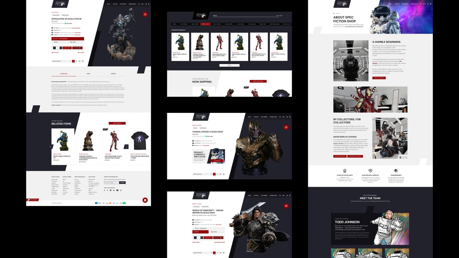
Because of that herculean effort, I wanted those images showcased as deep into the experience as possible - on the homepage, in search results, as a showstopper on the product detail page, and right down to the mini-cart. The imagery makes the whole site feel like a passion project: made for collectors, by collectors.
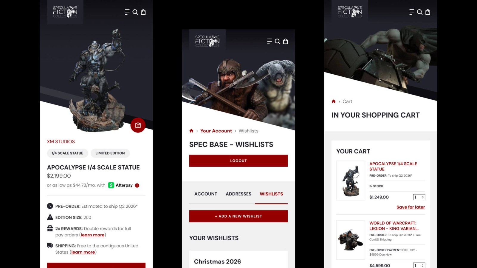
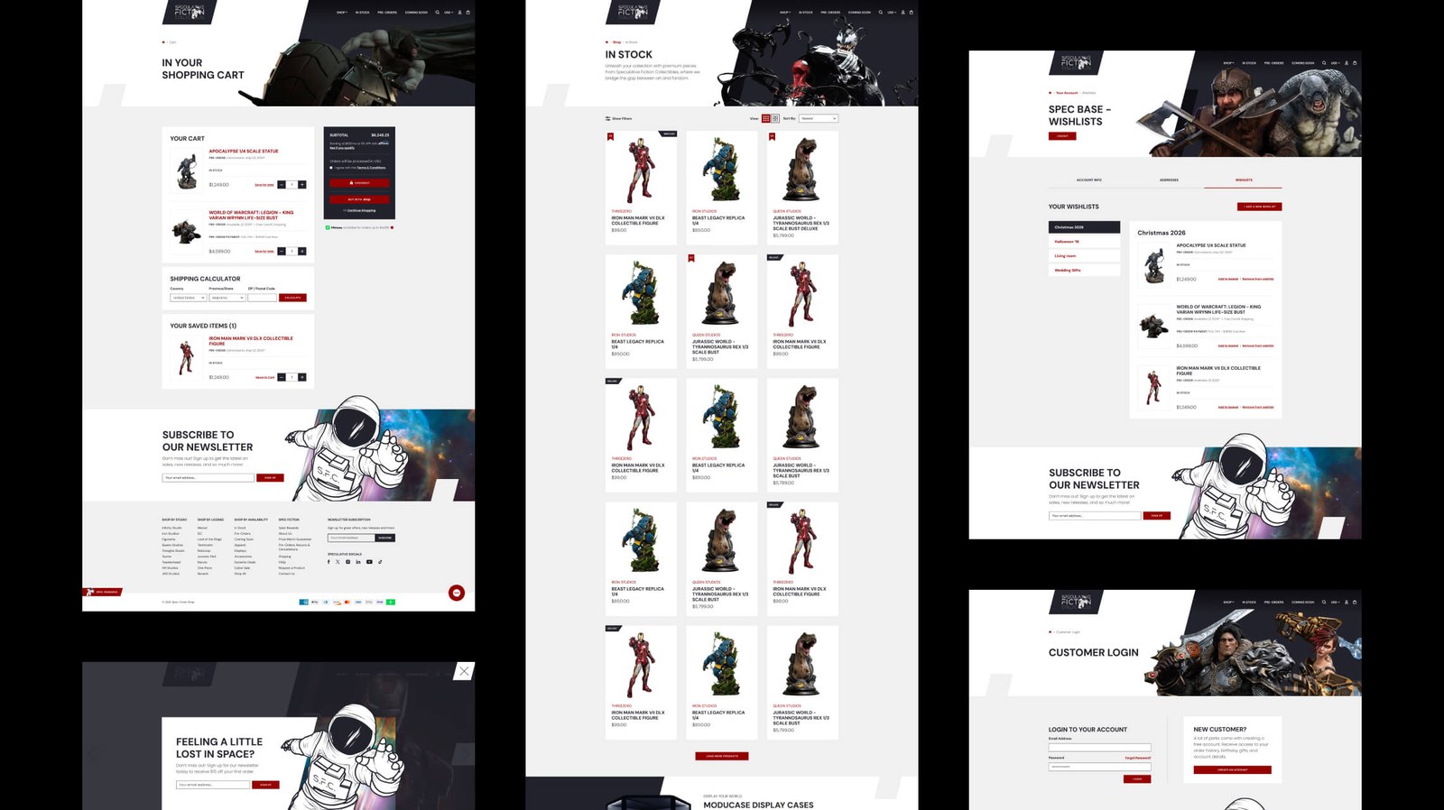
Given Todd's own responsibilities to the brand, the role called for a strong project-management lead alongside the design work, pairing closely with lead developer Erik Ryerson. That meant plenty of on-the-fly decisions, additional designs and alternate concepts, all backed by the confidence Todd placed in us to take his vision and turn it into a viable product that elevates the brand beyond its peers.
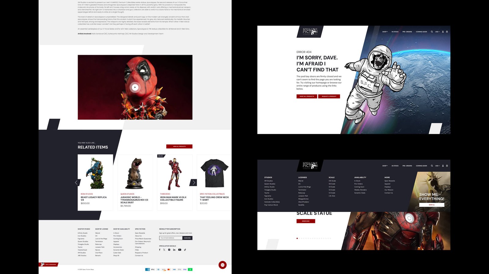
The site evolved daily, using the full design set as a foundation and revising it against new features Shopify rolled out, features Todd had always wanted, or whatever our small team could dream up to improve the buying experience. The site is now as much an archive of rare grails and obscure finds as it is an eCommerce store showcasing the latest pre-orders and most sought-after items - arguably one of the projects I'm proudest of in the portfolio, and certainly the one with the most of our fingerprints on every page and product.
By collectors, for collectors - indeed.